Journals144
Newest
Thanks!
1 min read
Thanks for all the birthday wishes everyone!
Join the community to add your comment. Already a deviant? Log In
Putting an end to this
3 min read
Many of you who watch me have noticed that the first thing I write under every photo I post is:
"I encourage everyone to please view this image on my website I use a dark neutral background that makes viewing art much more pleasing to the eye."
This is my only real gripe with deviantART, and one that if they fixed, I feel could significantly improve the look and feel of the site as a whole.
The main reason I post this is because I can't understand for the life of me why deviantART, an ART website, would choose a very awful shade of green to use throughout their website to showcase art. It's my opinion, and the opinion of pretty much any art site you visit (red bubble, 500px, 1x etc) that there should be a neutral background to a website where you are showcasing art. It really should be black or white or anything in between (shades of grey) This weird, gross shade of green just makes everything look worse. It's such a great site, with SO many talented artists, I can't figure out why they can't drop the green. Now, I've written a journal before about this subject, and while most agree with me, I get a few people saying things like "I don't think I see any green on the site, It looks grey to me." Well, yeah, it's a shade of green that's close to grey but anyone with an eye half tuned into color will see green. Another persons problem may be screen color calibrating issues. If you really are seeing grey, that's not good, because it means you're seeing all of your other colors wrong as well. I also get a lot of the same type of comments directly on my image page, saying the same thing. A lot of times I hear "you only write that to get people to go to your website" well, yes.. admittedly I will take any opportunity to direct people to my personal website because that's where I sell my prints. I wouldn't put it there if I didn't truly believe that photos look much better on my website though. I cringe sometimes when I see how a photo of mine looks against this background. It's not the end of the world or anything, but I wish a site wide color change would take place.
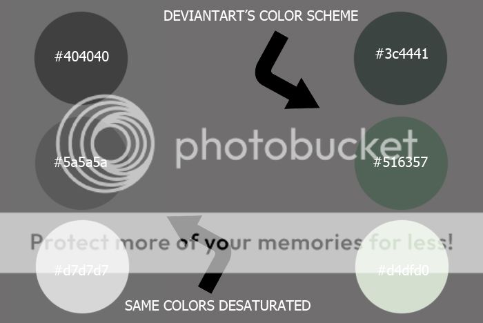
And for those of you who don't believe me about the color: (maybe I was bored, haha) Here is a handy chart to show you.
On the right you will see the obviously green shades of deviantART's color scheme (hex numbers included in the circles) against a neutral grey background. The circles on the left are the exact same colors only desaturated. Obviously, since they have color in them, desaturating takes them down to different shades of neutral grey. You'll also notice the only color that didn't change during the desaturation is the neutral background grey. So, hopefully now when people comment that I'm crazy for seeing green on this page I can just send them a link to this journal instead of having to explain it over and over.

Thanks for reading. I will go get a life now!
"I encourage everyone to please view this image on my website I use a dark neutral background that makes viewing art much more pleasing to the eye."
This is my only real gripe with deviantART, and one that if they fixed, I feel could significantly improve the look and feel of the site as a whole.
The main reason I post this is because I can't understand for the life of me why deviantART, an ART website, would choose a very awful shade of green to use throughout their website to showcase art. It's my opinion, and the opinion of pretty much any art site you visit (red bubble, 500px, 1x etc) that there should be a neutral background to a website where you are showcasing art. It really should be black or white or anything in between (shades of grey) This weird, gross shade of green just makes everything look worse. It's such a great site, with SO many talented artists, I can't figure out why they can't drop the green. Now, I've written a journal before about this subject, and while most agree with me, I get a few people saying things like "I don't think I see any green on the site, It looks grey to me." Well, yeah, it's a shade of green that's close to grey but anyone with an eye half tuned into color will see green. Another persons problem may be screen color calibrating issues. If you really are seeing grey, that's not good, because it means you're seeing all of your other colors wrong as well. I also get a lot of the same type of comments directly on my image page, saying the same thing. A lot of times I hear "you only write that to get people to go to your website" well, yes.. admittedly I will take any opportunity to direct people to my personal website because that's where I sell my prints. I wouldn't put it there if I didn't truly believe that photos look much better on my website though. I cringe sometimes when I see how a photo of mine looks against this background. It's not the end of the world or anything, but I wish a site wide color change would take place.
And for those of you who don't believe me about the color: (maybe I was bored, haha) Here is a handy chart to show you.
On the right you will see the obviously green shades of deviantART's color scheme (hex numbers included in the circles) against a neutral grey background. The circles on the left are the exact same colors only desaturated. Obviously, since they have color in them, desaturating takes them down to different shades of neutral grey. You'll also notice the only color that didn't change during the desaturation is the neutral background grey. So, hopefully now when people comment that I'm crazy for seeing green on this page I can just send them a link to this journal instead of having to explain it over and over.

Thanks for reading. I will go get a life now!
Join the community to add your comment. Already a deviant? Log In
Another DD
1 min read
I'm flattered!
Join the community to add your comment. Already a deviant? Log In
Join the community to add your comment. Already a deviant? Log In
Somebody tell me something inspiring.
1 min read
do it!
Join the community to add your comment. Already a deviant? Log In